Editorial guidance only. Product characteristics, care needs, and commercial terms should be confirmed in writing for any specific item.
Explore our product collection for individual designs, photographs, and product details. When considering jewelry trends, look at each piece in the context of your own preferences and practical needs. Use the product description to check relevant specifications rather than relying on appearance alone. For a more personal recommendation or a question about a particular piece, contact katherine jewelry with the details that matter to you.
Start With Proportion, Not the Size of the Statement
One way to approach jewelry trends in 2026 is to think about proportion before spectacle. A visually substantial earring can feel restrained beside a crisp shirt, while a tiny pendant can become the focus against an uninterrupted dark neckline. The useful question is not whether a piece looks bold on its own, but what role it plays within the whole outfit. Begin with the clothing you actually wear, including its collars, sleeves and usual layers.
Try a simple focal-point exercise before leaving home: identify the area you want the eye to notice first. If that is your face, use earrings as the main gesture and reduce competing detail around the neck. If you prefer emphasis lower down, a pendant or bracelet may be more effective. This makes jewelry trends easier to interpret because each new shape has a job, rather than merely adding another object to the outfit.
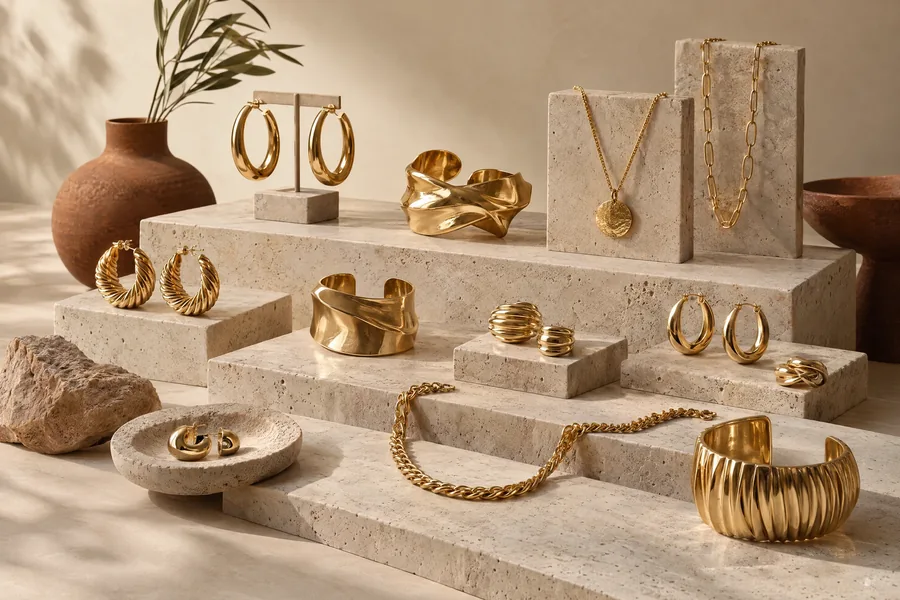
For a concrete workday example, imagine a loose blouse, straight trousers and flat shoes. A rounded, sculptural earring might supply enough definition without a necklace, especially when the blouse already has an open or gathered collar. Browse sculptural design inspiration to consider contour and negative space, then compare those ideas with earring concepts. These pages offer visual prompts; they do not establish materials, dimensions, availability or how an illustrated design would feel when worn.
Scale also has a practical side that photographs cannot settle. Before adopting jewelry trends involving larger forms, consider whether earrings move comfortably when you turn your head, whether a necklace interferes with a collar and whether a ring catches on a pocket. Ask for actual dimensions and weight when evaluating a real item. A visually generous outline is not a reliable guide to physical weight, and your comfort matters more than matching an editorial image.
Use a mirror at both close range and across the room, then take one ordinary outfit photograph without zooming in. If every accessory demands equal attention, remove or simplify one element. If the jewelry disappears and you wanted a focal point, change its placement or outline before adding more pieces. Our proportion-first reading of jewelry trends leaves room for quiet dressing as well as dramatic shapes: success is a clear relationship between the accessory, the clothing and the person.
Mix Finishes Through Repetition and Contrast
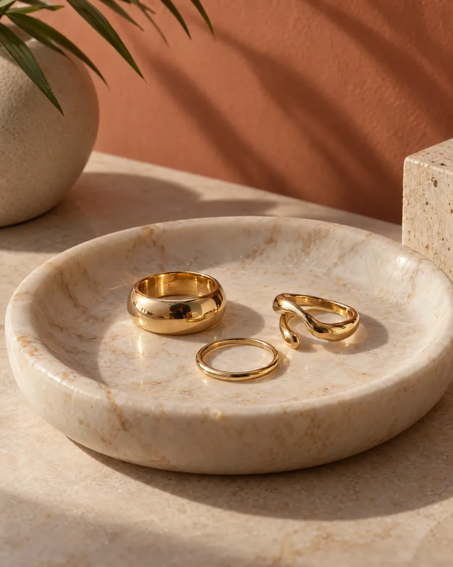
Mixed finishes are an appealing editorial direction because they make room for the pieces someone already owns. Instead of treating jewelry trends as a reason to build a perfectly matching set, use them to explore relationships between warm-looking and cool-looking surfaces, smooth forms and textured ones. Keep the vocabulary visual at first. A gold-colored appearance does not establish gold content, just as a silver-colored surface cannot tell you which metal or coating is underneath.
The easiest starting rule is to repeat one feature while varying another. Pair different surface colors through a shared rounded shape, or connect two contrasting textures through similar proportions. For example, a smooth, narrow bracelet and a textured ring may feel coherent when both have uncomplicated outlines. This approach to jewelry trends avoids the pressure to coordinate every detail. It also gives an inherited or long-owned piece a place beside something with a different visual character.
Layering works better when each component remains legible. With necklaces, compare where the pieces sit rather than assuming several lengths will automatically create a pleasing arrangement. Try two first, move around, and check whether pendants collide or chains gather together. The necklace design concepts can help you think about spacing and pendant shape. When translating jewelry trends into an actual purchase, ask for measurements and closure details instead of estimating them from an image.
For a weekend outfit, imagine a plain T-shirt and a jacket with visible buttons or a zipper. Those clothing details already contribute metallic color and texture; they need not match your jewelry exactly. Repeat one tone somewhere else if you want the combination to look more deliberate. Jewelry trends become easier to adapt when you include watches, belt hardware and bag fittings in the visual picture, rather than judging rings and bracelets in isolation.
Keep style experiments separate from material assumptions. The FTC’s Jewelry Guides provide a useful framework for truthful descriptions of metal content, gemstones, treatments and production. Request written details when considering a real piece, including whether its surface is plated; plating is not identical to solid metal throughout. The lasting value of mixed-finish jewelry trends, from our perspective, is freedom to coordinate thoughtfully—not permission to overlook the information needed for an informed decision.
Use Color as an Accent With a Clear Purpose
Color offers another personal route through jewelry trends, especially for someone whose clothes stay within a narrow palette. A small colored accent can alter the mood of navy, cream, charcoal or brown without requiring a different wardrobe. Rather than choosing a supposed color of the year, decide what you want the accent to do: soften a severe outfit, sharpen a muted one or echo a detail you already enjoy in a scarf or print.
Start with one color relationship. An accent close to a garment’s color can create a quiet, integrated effect; a more distinct accent can establish a focal point. Neither is inherently more current. For an evening dinner, you might keep the outfit and accessories simple, then let one colored pendant carry the visual interest. This is a manageable way to test jewelry trends because you can assess a single change without rebuilding the entire combination.
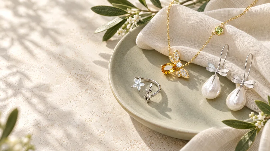
Consider placement as carefully as hue. Color near the face is more immediately noticeable than a small detail on the hand, although gestures can make a ring expressive in conversation. Explore ring design inspiration to compare broad and narrow arrangements, not to infer gemstone identity. Our editorial reading of jewelry trends includes color as a design tool, while recognizing that lighting and screens can change its appearance. Seek additional views or descriptions when evaluating an actual item.
Pearl-inspired forms offer a different kind of accent: their visual appeal can come from rounded shape, surface appearance and contrast with sharper clothing lines. A simple knit and structured trousers, for instance, might invite a softer-looking detail rather than a bright hue. The pearl design concepts are inspiration, not proof that an image depicts natural, cultured or imitation pearls. Following jewelry trends should never require guessing which material a seller means; ask for that distinction in writing.
Give every color experiment a short real-life trial. Wear the combination with two familiar outfits and look at it in different light, then note whether you enjoyed the effect or merely liked the initial photograph. If a color feels distracting, reduce its visible area before abandoning it. If it feels flat, simplify nearby accessories. This way, jewelry trends become a practical language for adjusting emphasis, rather than a demand to adopt a palette that does not suit you.
Build a Repeat-Wear Edit That Fits Your Routine
The final direction in our 2026 perspective is less about a particular silhouette than a method: choose combinations you can repeat. Jewelry trends can be interesting without earning a permanent place in your routine. Start by laying out the pieces you already reach for and identifying why they work. Perhaps the closures are easy to manage, the proportions suit several necklines or the shapes remain comfortable through a long day. Those observations are more useful than an abstract wish list.
Create three small combinations for different circumstances: an ordinary workday, a relaxed day and an occasion that calls for more emphasis. Reuse at least one piece across them if possible. A familiar pair of earrings might stay constant while the necklace changes, or one ring might connect all three outfits. This gives jewelry trends a defined place in the rotation. You can test a new idea against an existing combination instead of judging it only in isolation.
Before adding anything, name the gap in a sentence. “I want a shorter necklace that remains visible above my usual neckline” is more actionable than “I need something current.” Include practical limits, such as interference with sleeves or difficulty fastening a clasp. If a website concept prompts an inquiry, use the contact page to ask what information is available about actual offerings. Treat jewelry trends as the starting point for questions, not evidence of stock, specifications or suitability.
Care belongs in the decision, too. The GIA’s jewelry care guidance recommends removing jewelry before swimming or household cleaning and storing pieces separately with padding to reduce scratching. Cleaning must suit the complete construction, including any gem treatments; ultrasonic cleaners are not universally safe. When materials are uncertain, consult a qualified jeweler rather than trying aggressive home recipes. Adapting jewelry trends thoughtfully includes understanding the maintenance a real piece may need before committing to it.
At katherine jewelry, this editorial view of jewelry trends ultimately favors recognition over reinvention: the best experiment still feels like you. Keep the proportion that works, repeat a useful visual connection and introduce color only where it adds something you enjoy. Then judge the result during an ordinary day, not just in a carefully arranged photograph. A personal-style edit is complete when it makes getting dressed more satisfying—not when it contains every idea that caught your attention.