Editorial guidance only. Product characteristics, care needs, and commercial terms should be confirmed in writing for any specific item.
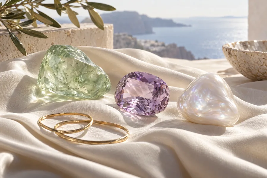
The gemstone color that catches your eye in a photograph may look quieter beside a window or warmer beneath a restaurant lamp. That difference does not automatically mean something is wrong: light, surroundings, photography, and display settings all influence what you see. Understanding how gemstone color changes with lighting and screen settings helps you compare images more thoughtfully and choose a palette that works in your everyday life. This guide separates those influences, explains what photographs cannot establish, and offers practical ways to judge color without treating an attractive image as proof of a stone’s identity, treatment, or quality.
Read the Light Before You Judge the Stone
Start with the light source rather than the name of the shade. What reaches your eye depends partly on the light falling on a stone and how that material interacts with it. Daylight, household lamps, and office lighting can make the same object appear different. For a useful first comparison of gemstone color, use indirect daylight near a window, away from strongly colored curtains or walls. Treat that as a reference condition, not the single definitive version of the stone.
Next, compare the piece under lighting you actually use. A blue-looking stone might seem less vivid under a warm lamp, while a warm-looking stone may appear richer. These are possibilities, not rules for every material or bulb. Modern lamps differ even when their packaging describes a similar shade of white. Evaluate gemstone color at your desk, in your living room, and under your usual evening lighting rather than assuming that one showroom view predicts every setting.
Keep the surroundings consistent while you test. Place the piece on a plain white or neutral gray surface, then move it to your hand or neckline. A bright sleeve, nearby colored object, or reflective setting can influence the impression. Change only one condition at a time: first the light, then the background, then the viewing angle. This makes it easier to tell whether gemstone color is responding to the room, the contrast around it, or the way light passes through the design.
Angle matters as well. Faceted surfaces can alternate between bright reflections and darker areas as a piece moves; a single still photograph may capture only one of those moments. Some gem materials also show different colors in different lighting or viewing directions, but a casual visual test cannot identify the cause. If gemstone color seems dramatically different, ask for a description of the material and any known optical behavior instead of diagnosing it from a photograph.
Finally, make the comparison brief and sensible. You do not need prolonged direct sun, a hot lamp, or repeated temperature changes to observe appearance. GIA’s jewelry care guidance explains that light and heat can damage some materials. The practical decision rule is simple: judge gemstone color under several ordinary, safe conditions, then prioritize the condition in which you expect to wear the piece most often.
Separate Screen Appearance from Material Evidence
A screen adds another layer between a stone and your eyes. The camera’s exposure, white balance, editing, and surrounding scene can all affect the recorded image before it reaches your device. Your display then interprets that file through its own settings. Comparing gemstone color online therefore means evaluating a representation, not making a direct observation. Even a sharp, attractive image cannot independently establish gemstone type, treatment, natural or laboratory-created status, or the metal used in its setting.
Before comparing images, turn off night mode or other settings that deliberately warm the display. Disable automatic color adjustments if your device allows it, and use a comfortable, consistent brightness rather than the brightest possible setting. View the pictures in a room without a strongly colored light source. These steps reduce some distractions, but they do not calibrate your screen or guarantee accurate gemstone color. A second device can reveal disagreement; it cannot tell you which display is correct.
Compare like with like whenever possible. A close-up against black velvet is not directly comparable to a distant view against white paper. Different exposure choices can make a stone appear lighter, darker, or more saturated. Look for multiple views with an ordinary background and consistent lighting. If gemstone color is a deciding factor in an actual inquiry, ask whether daylight and indoor images are available, whether the images were edited, and whether the same piece appears throughout the comparison.
Explore our product collection for individual designs, photographs, and product details. When considering gemstone color, look at each piece in the context of your own preferences and practical needs. Use the product description to check relevant specifications rather than relying on appearance alone. For a more personal recommendation or a question about a particular piece, contact katherine jewelry with the details that matter to you.
When moving from inspiration to a real purchase decision, request written material details from the seller and clarify how the actual item can be assessed. The FTC Jewelry Guides address truthful descriptions of gemstone identity, treatments, and other material claims. Keep your gemstone color preference separate from those facts: “soft violet in daylight” expresses a visual goal, while a material description establishes what the item is. Neither should be substituted for the other.
Choose a Palette for Your Clothes and Routine
Once you understand the viewing conditions, shift from asking which shade is objectively best to asking which shade serves your wardrobe. Color preferences are personal, and there is no mandatory gemstone color for a particular complexion, age, or occasion. Begin with three outfits you genuinely wear: perhaps a work shirt, a weekend knit, and an evening top. Notice whether you want the jewelry to blend into those clothes, provide contrast, or become the main point of interest.
For a blending approach, repeat a color already present in an outfit, but allow the jewelry to be lighter or deeper. A muted green concept beside an olive jacket can feel cohesive without matching exactly. For contrast, imagine a cool blue accent against a rust-colored top, or a warm red accent against gray. These are editorial styling ideas, not fixed formulas. Test gemstone color against actual fabric because texture, pattern, and sheen can change how strong that contrast feels.
Scale changes the effect of a hue. A small colored accent may be easy to wear even when the same color would feel dominant across a broad pendant or large pair of earrings. Explore earring design inspiration for ideas about color near the face, and necklace concepts for placement against a neckline. Consider gemstone color together with size and position; choosing the hue alone leaves out much of the visual decision.
The surrounding metal color is another design variable, not proof of composition. A yellow-toned setting can create a different overall impression from a white-toned or pink-toned one, especially around a pale stone. Try comparing concept images with similar proportions but different surrounding tones, remembering their illustrative limits. If you favor ring design concepts, also consider how gemstone color relates to sleeves, nail polish, and other pieces you wear on the same hand rather than judging the ring in isolation.
Make your final shortlist practical: one understated palette for frequent wear and, if useful, one stronger palette for occasional outfits. A stone that looks wonderful under evening light may suit your routine better than one whose appeal depends on bright daylight. Write a short preference statement such as “medium blue, noticeable against white, not too dark indoors.” That gives gemstone color a usable context and helps you communicate your aim without relying on subjective labels such as perfect, premium, or universally flattering.
Build a Reliable Comparison and Keep It Useful
Turn your observations into a small comparison record rather than collecting endless screenshots. For an actual piece you can inspect, note the light source, background, viewing distance, and overall impression. Describe gemstone color in ordinary terms: hue is the color family, tone is how light or dark it looks, and saturation is how vivid or muted it appears. You do not need a professional grading vocabulary to record “green-blue, medium dark, softer under the desk lamp.”
Use the same sequence each time: indirect daylight, your usual indoor light, and the intended outfit. If taking photographs, keep the background and camera position consistent and avoid filters. Include a neutral reference surface, while recognizing that it does not make a phone photograph color-accurate. A useful gemstone color record captures patterns rather than promising exact reproduction. If one candidate consistently looks too dark in your normal room, that is more relevant to your enjoyment than its brightest photograph.
Separate a temporary change in appearance from a possible care issue. Fingerprints, residue, or a dirty surface can affect how light travels through or reflects from jewelry, but do not assume every difference needs cleaning. Never use chemicals, heat, or an ultrasonic cleaner simply to recover a remembered gemstone color. The complete construction and any treatments matter. If the materials are uncertain, ask a qualified jeweler about suitable care; remove jewelry before swimming or household cleaning and store pieces separately with padding.
For an inquiry, send a concise description of your preferred appearance, the conditions in which you assessed it, and the information you still need. You can use the contact page to ask katherine jewelry about the scope of its design concepts and any available factual details, without assuming that an illustration represents stock. Describe gemstone color as a preference, then ask separately about actual materials, treatments, and whether any real-item images or inspection options exist. Do not assume those options are offered.
The aim is not to force a gem to look identical everywhere. It is to understand which differences come from ordinary viewing conditions, which remain uncertain, and which matter to your style. Start with safe, repeatable lighting; reduce screen distortions; test colors against your wardrobe; and obtain written material information before making a material-based decision. With that approach, gemstone color becomes a considered part of choosing jewelry rather than a promise extracted from one persuasive image.